Category Archives: “Faber castell”

UK holiday – nature sketches

During my recent one month holiday in the UK we visited five cities. I was sketching all the time, filling two and half sketchbooks with my watercolour pencil and Lamy Safari ink pen sketches. All of these are gradually being added to my Flickr album online. 

However, just because we were in cities, does not mean that all the sketches were of  man-made objects. Today’s blog shows the nature sketches 

some we happened upon in parks 

in Nature Reserves 

These deer sat right next to the fence and posed for us in the Deer Grove at Magdelene College, Oxford.  I sketched them for a long time and there are three pages of sketches in my book. 

or collected along the way 


These were drawn in the hotel over a few nights, so I could spend time on the detail.


A special visit to Tiggywinkles Hospital

and sadly, one found dead on the Clifton Suspension Bridge in Bristol


These all added to the richness and memories of the holiday. 


back home after my UK holiday

I have returned from my one month holiday in England and Scotland. I had a wonderful holiday  and filled two and half Moleskine watercolour sketchbooks (13 x 19cm).

Squirrel meet watercolour pencil, watercolour pencil meet squirrel.

(Thanks to Mum & Jules for your patience while I waited to line up this photo)

I took my usual sketching equipment and put pencil to paper as many times a day as I could. I have so many tales to tell. However, I have not even started scanning my sketchbook pages and this will be done over the next few weeks.   While on holiday I instagrammed (alissaduke1) a sketch daily if you would like to have a glimpse of some of them. 

This week’s blog is just a little taste of things to come. 


I felt that GREEN was the colour of my holiday (although when I look through my sketchbooks, it does not feature heavily).  Specifically Grass Green (Faber Castell) ! I used this pencil so often in the UK – the grass was SO green and the trees are a different shade.

My other main green colour was Pine Green . The colours that I use in Australia, but did not use as much in the UK were Earth Green, Olive Green and also Light Yellow Ochre.


We walked through quite a few parks and looked out many train windows onto the green countryside.  Although the UK was going into autumn, the trees had only just began to change and only some leaves had fallen. 

More to come…


travel sketching classes

I am running Travel Sketching classes in Melbourne in over July and August.

In the cooler/cold Melbourne Winter months it not practical to run my Travel Sketchwalks in East Melbourne, However, you can still sketch in the cold weather and I have TWO travel sketching classes to inspire and motivate you.

Class One: Travel sketching

Have you ever wanted to sketch as you travel, adding a drawing to your diary or creating a whole travel journal, but not sure where to begin?

In this class learn to use watercolour pencil to create a travel journal. Learn to look and see in a different way  – it is all about capturing the impression of the moment.  Your sketches in your travel sketchbook will bring back memories of a time and place when you look at them.  

Class Two : Travel Sketching – food and drinks.

Learn to use watercolour pencil to sketch the food you eat, your drinks and the places that you stop for meals when travelling, capturing the impression of the moment.

Looking back at the pages of your sketchbook you will relive the sights, sounds, taste, and smell through your lines, colours and words on the page . 


For more details on dates and prices and to book for one or both classes at  www.trybooking.com/eventlist/travelsketching 

I look forward to seeing you and sketching with you !

the watercolour pencils I use

Last week I drew (in watercolour pencil) the watercolour pencils that I have in the sketchkit that I carry with me everyday. I carry 26  colours that I like and which suit what I draw and my style. There are over 120 colours in the FaberCastell Albrecht Durer watercolour pencil range. I do not own them all and have built up my collection over time.

I knew that I had drawn my pencils previously and was curious to see which colours had changed over time. I know that the vast majority have stayed that same and was aware that a few had been changed along the way . My drawings were from 2013. 2016 and 2018. They were drawn as part of my pre holiday packing. 


Looking back, I see that I have not swapped too many colours over the past 5 years. I have put an asterisk next to those few that I am not as pedantic about. There are often a few variations on colour in the range and for some of these I am happy to use whatever spare I have in my pencil box at home or can buy at the art shop. 

Here is a long list of the Faber Castell Albrecht Durer watercolour pencils I carry with me. There are two Derwent watercolour pencils and I use them as I cannot get the same colour in FaberCastell. Sometimes the names of colours are changed, which makes life a little confusing. I think Light Orange used to be Orange Glaze.

I have put some quick notes about how or why I use these particular colours. These are a personal choice.

Ivory – I use this all the time – buildings, food, often useful when something is not white
Light chrome yellow * there are a few yellows I could use
Light Orange – not used often, but a lovely real orange 
Scarlet red * it is an orangey-red. There are a few different colours I could use 
Magenta – useful for iron lace of buildings
Venetian Red – great for buildings. I used this a lot in my 2016 visit to Manchester . I also used Indian Red there 
Madder Carmine (Derwent) – a real red
Pink madder lake – don’t use often, but it is a real pink
Blue violet * handy to have but I could easily use another colour
Indanthrene blue – I use for shadows, skies, darkening area of a page. I just really like this colour
Ultramarine – so handy for everything
Skyblue – a lovely sky colour on the page, but turns grey when water is added. Good for skies of Melbourne 
Grass green – that hint of bright green in grass, trees
Chrome oxide green  – trees, iron lace of buildings. very useful
Mineral Green (Derwent) – a real green
Earth green – a wonderful colour for Australian – trees, 
Light flesh –for a hint of flesh tone on a face or limbs. often combined with a hint of one of the brown colours below
Cold grey IV – often used for many reasons
Warm Grey II – good for buildings – I bought this when I moved to Melbourne, as the Sydney sandstone was a very yellow colour 
Payne’s grey – I use this a lot 
Black – not often, but very useful
Dark sepia – I have recently discovered and love this colour 
Light yellow ochre This colour and the rest of the list I often use together. I draw a lot of nature objects and food, coffee. I can build up a lot of depth in an object using a combination of these colours. 
Burnt ochre
Brown ochre
Raw umber
Burnt umber
Burnt siena
Walnut brown

I will probably change a few when I visit the UK in September to suit the buildings and greens of the UK, 


What are your favourites in your sketchkit ?

motorbike and egg on toast

Two sketches from this week, showing two ways of using watercolour pencils. 

This sketch of a motorbike was done in five minutes, well actually six.

I arrived at the Post Office five minutes before it opened, so I knew that I had five minutes to sketch, There were places to sit and I very quickly decided to draw the motorbike, instead of the small queue of people waiting, or the crane across the road.  I took out the two pencils I would need  – black and  red. I put down some very quick marks down with the black to get all the shapes in place, the started with the left-wing mirror. (I think) I worked left to right and down the page, I stayed just one minute after the Post Office opened to add some final hard lines – the tyres, the front lights and windshield. I decided not to add any water.

Faber Castell colours used: 

  • Schwarz Black
  • Scarlet Red


My dinner was an egg on toast. It looked do delicious and I obviously wasn’t that hungry as I drew it before starting to eat. About two third was done from real life and the final details from my head. These included the detail on the toast and adding extra depth of colour to some parts of the egg yolk. You can get a lot of depth and colour from watercolour pencils by building up layers. It requires a little patience to allow the paper to dry before adding the next colour. 

Faber Castell Colours used

  • Light Orange
  • Light Chrome Yellow
  • Light Yellow Ochre
  • Cool Grey IV
  • Payne’s Grey
  • Walnut Brown
  • Burnt Umber
  • Brown Ochre
  • Burnt Ochre

Happy sketching !

Local house sketch – commission

I am very happy to be able to reveal a recent drawing commission that I have just completed. It was given as a birthday gift and now that the birthday has passed I am excited to share the final drawing and my ‘work in progress’ photographs.

It is a local East Melbourne house built in 1890. East Melbourne has a long history and a wide variety of architectural styles, all with great character.  

It was completed over three weeks in the evenings and on weekends. I took about 50 photos and visited three times to take those photos. The last visit was to photograph some details and get colours right. Although it was on portrait size paper, I drew in a square as the house fitted in that shape , I decided early on not to include a sky .

The watercolour pencil drawing was done on A3 watercolour paper (about 210 gsm weight).

This blog post shows it as a work in progress. I remembered to take photographs on my ipad and phone along the way. I wish that I had decided to purchase an A3 (instead of A4) photocopier/scanner when I purchased a new one only a few months ago. 

The first few sketches were on A3 photocopy paper. I was trying to figure out how big to draw the house on the page and what to include.


          I started with the outline and then built up the easiest blocks of colour. 


The owner suggested to add the crab apple tree in flower and nastursiums peaking through the white fence. These additions really give it a lot of a balance and interest, They are also a true reflection of the house in its many seasons.

It was wonderful challenge. I have only done a few drawing commissions and this was slightly larger than my usual drawing in my sketchbook. The larger drawing allowed me to focus in on some interesting detail and character of the house. 

drawing lunch step by step

Another step by step drawing. 


My lunch. Drawn as a work in progress, knowing that I would probably eat it cold as I stopped to take photos along the way.

I draw all the main shapes and colours in their watercolour pencil colours. I do this so that when I add water to those lines, they become the object, rather than leaving an outside line.

I decided to add some of plate . I had considered just the food and chopsticks – you don’t need draw the plate to show the food is   on a plate. The viewers mind/imagination fills in this information.


I gradually build up the colours, adding dark. I decided not add dark around all  of the plate.

These are the watercolour pencils I used . I have about 26 in my pencil wrap and rarely use any outside of these (I have many other colours in the range in a box).

By this stage the page was getting murky and I was getting hungry. Time to stop and eat !

an open book

An old open book has so much potential – what do you see written?

open book

This is my dilemma.

I have drawn a beautiful old book with yellowed pages, brown spots on the page (known as foxing) and a worn spine.

The book is open , inviting you in to read. However I do not want to use the original title page of the book as it is Ecclesistical Cases law reports published in 1703. I have drawn this on a loose sheet of A4 paper and may want to have it printed as a card or print in the future. I would like to have a wider audience than lawyers.

I ask for your suggestions on what you can visualise written on the opening pages of  this mysterious book  …

The thoughts so far – please comment and makes suggestions

  • leave it blank
  • Once Upon a Time
  • an illuminated letter or elaborate image or frontispiece

I look forward to reading your ideas and will let you know what happens in a future blog post .

*this was drawn with watercolour pencils in my lunch breaks at work . Warm Grey II, Burnt Ochre, Paynes Grey, Ivory, Raw Umber, Sketched lightly in HB pencil first to get the perspective and proportions in place.


t

books – work in progress

This is about a drawing I am currently creating. (I don’t like to use the term “working on” because it is not work at all).

This week I have been drawing in my lunch breaks. I usually draw for about half an hour. This is the result at the end of the third day.

17Apr15 books wip closeup

I took my watercolour pencils and A4 size University paper (I believe it is produced by St Cuthberts Mill in the UK). I sat at a table next to these law reports and started drawing. These are at eye level and all the shelves are full of books. On the shelf there are books either side of these and they are neatly and tightly shelved.

DECISIONS TO MAKE

I did not really think before I started drawing and now I have some decisions to make. I thought I would share my options with you now and would love to hear any suggestions anyone has.

  • How many more books to draw?
  • 17Apr15 books wip1

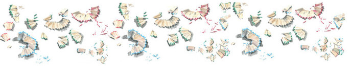
    Current drawing on A4 page

    I only have a limited space on the paper to use. This is what is looks like on the A4 page.  I have photocopied the drawing and experimented with HB pencil for potential composition. I realised one of my first ideas would not work as I did not have room on the page to draw a few books lying down on the right side, stacked up.

    I have the options of adding more books of different heights and thicknesses and/or have some books leaning.


    19Apr15 test

    I could try this


    19Apr15 test1

    Or this, or a combination

    • How to finish the sides – I have the choice of fading the colour and lines at the edges  to have an unfinished look  OR finishing each  book and having solid colour to the edge of each book.
    • How to finish top – The books are on shelves and the books disappear into darkness of the shelf. I don’t want this is dominate the page.
    • How to finish the bottom – The books are sitting on shelves. Do I finish at the base of the book or include the shelf line.

    I am looking forward to any suggestions and will share the completed drawing when I have finished it!

    ABOUT THE DRAWING


    19Apr15 colours

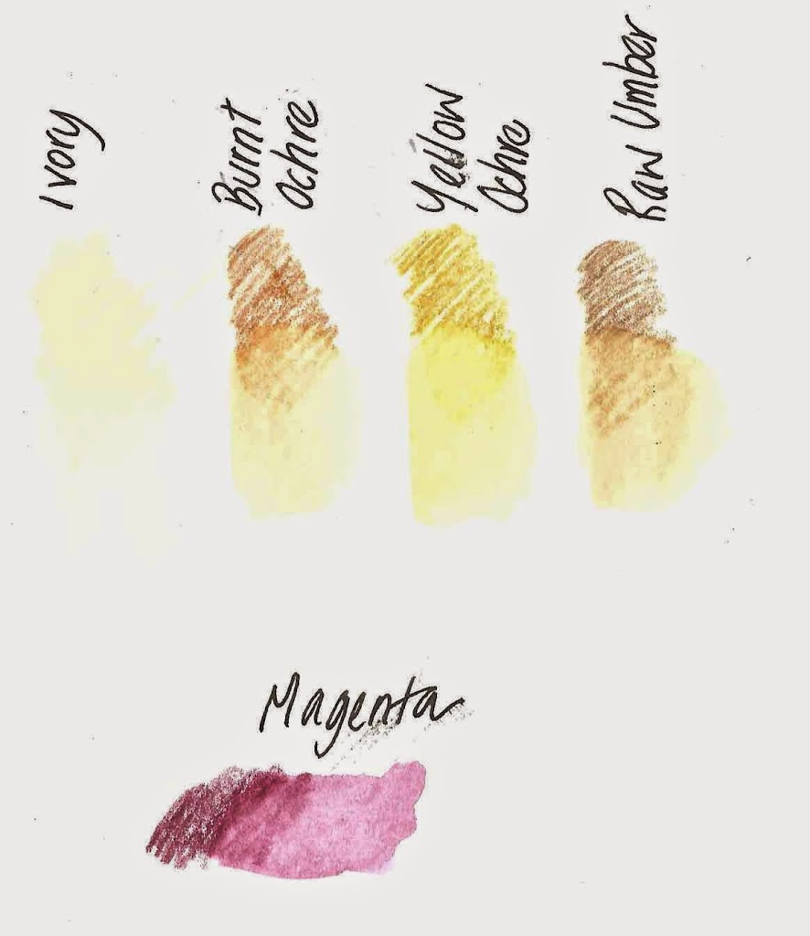
    These are the colours I am using. There are 120 watercolour pencils in the Faber Castell range. I carry and use 26 colours in my pencil wrap and they suit me perfectly. I can usually create the colours I need by blending. This is done on the page or off the tip of the two pencils on the waterbrush.

    The pigments can be completely dissolved, and will then behave similar to watercolour paints. The paint becomes permanent when dry, enabling other layers of colour to be built up without causing it to dissolve again. Or they can sharpened to a fine tip. Great for broad brushstrokes or finer detail.

    However I have to keep remembering to sharpen my pencil. They get blunt very easily when using the waterbrush to take the colour off the tip of the pencil.

    I build up the colour gradually. However, as you can see, I also draw in darker areas early as it gives me a sense of where I am going and what the drawing is going to look like when complete.

    Here is a previous work in progress library drawing https://www.flickr.com/photos/alissaduke/15429144837/in/set-72157648983342201
    and other book and library drawings
     https://www.flickr.com/photos/alissaduke/sets/72157648983342201/, some of which you can purchase on my Etsy shop https://www.etsy.com/au/shop/AlissaDuke
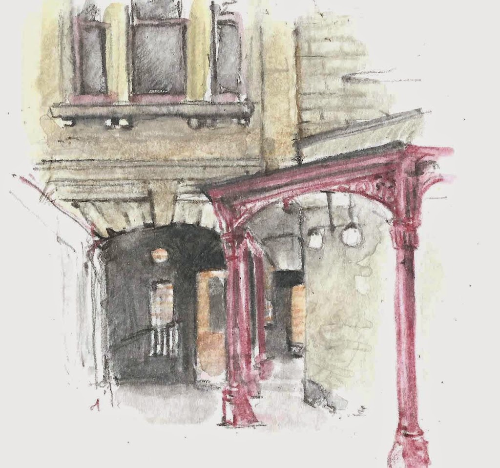
    New city – New pencil colours

    After a few sketches in Melbourne, I realised that the Faber Castell watercolour pencils colours that I had used to draw Sydney buildings in my Moleskine watercolour sketchbook were not going to capture the buildings of my new city. 

    It was only a subtle difference, but I could tell and was very aware of it. Often I feel that getting the colour just right can make or break a sketch for me. And sometimes colour makes an object or building recognisable, even if the actually drawing is way out of kilter!

    SYDNEY


    St Stephens Uniting Church


    Sydney hospital and eye hospital

    The sandstone of many of the historic buildings in Sydney gives the city some of its personality. It is called Yellow block  and is known for its warm, golden straw colour. The main public buildings in Sydney, completed from the 1850s until the 20th century were built in sandstone from Pyrmont where some 50 quarries operated.  Pyrmont yellowblock was hard, and had good texture, and colour, and it was also suitable for carving. By coincidence Pyrmont is the suburb I used to live in in Sydney . No quarries now, just streetnames, pub names the landscape continue the history

    In Sydney I used to following watercolour colours to sketch buildings:
    • Ivory
           combined with either

    •  Burnt Yellow Ochre or
    • Light Yellow Ochre or
    • little Raw Umber (which is a Derwent colour)

     The other colour I used in Sydney was Magenta on the ironlace and rails of buildings.
    • Magenta


      MELBOURNE

      In Melbourne, the city buildings have more grey than yellow to the stone. There are also other building materials such as  the completely different bluestone.
      I made a quick trip to explore a new art store where I tested a few new Faber Castell watercolour pencils for their colour, with and without water, and I came away with a few potentials.

      My new watercolour pencils are:

      • Warm Grey !
      • Warm Grey II
       and for the red ironwork
      • Burnt Carmine


       I have only had the chance to try out my new colours a few times, but I already feel a lot more comfortable with the colours and I think they are going to work just fine.  I will still continue to use Ivory and just a touch of the other colours, but now have a new set of colours for my new city!


      Supreme Court
      Melbourne Town Hall


      and here are the tested watercolour pencils drawn on a page together