Monthly Archives: August 2020

my new photo lightbox studio

This week I ordered and received in the mail a photo lightbox studio from a Sydney company Hypop.

I bought this as I am going to be taking photos of my “drawn in books” to put up on my ETSY online store. One of the amazing events that I had been invited to have a stall at this year was Clunes Book Town Festival. All events are cancelled this year and Melbourne has been in lockdown since March. At the moment we can only leave home for essential reasons (including food and exercise) once a day.

I am working from home and spending all of my time there. I am trying to be as productive as possible. I decided to put the books I would have had at a stall onto my ETSY online store. There are two shelves off books ready to go, with another two ready to draw in. I went on a fabulous shopping expedition with a friend in January, We went to lots of op shops in North Melbourne and Collingwood and found some gems.

I am purchasing books that are about to be discarded, Less than $5 – usually $5 for a handful or bag. They are the books no one wants – except me.

When you list an item on your ETSY store, you have the option of adding a number of photos. I had a lot of problems taking photos that did not get a shadow in them – of the iPhone, of me, from the multiple overhead lights in my apartment. Solution – to purchase a photo lightbox studio. The interior reflective surface, when lit, allows for photos without shadows. I am not a technical person, so this has been a steep learning curve. I took my first photos today. I am even more amazed that could actually put it together. There was a very helpful video on the store’s website. I was ok until they got to the bit that said “you will need two people for this”, but it is possible on your own…”

One hour and thirty minutes later, I switched it on and it worked! Now I just have to learn how to use my iPhone camera properly. I am sure there are plenty of YouTube videos for that!

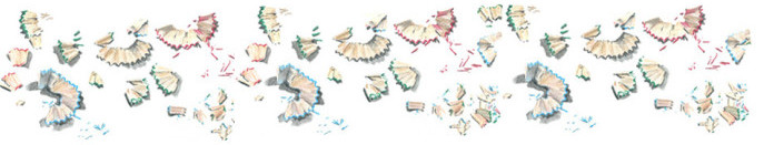
and the first photos are below. I still have a lot to learn, but it is a big step forward.

The other books I have put on my ETSY store this week include the ones below. I have not taken photos of these in my new photo lightbox studio yet. That may be next weekend’s project.

I have postage set for Australia. Please contact me if you would like to find out about international or express post

Enjoy.

sharing a pizza

It may look like a leftover bit of pizza to you. Why would you bother drawing it? In reality, this little sketch represents a lot to me.

This is a short and sweet blog this week. I have not been as busy in my daily sketchbook, as I have been “attending” some online sketching sessions and also preparing some “drawn in” old books to go to my ETSY online store.

This last piece of pizza on the plate was sketched after I finished a short (we had a bad connection) Facetime call to my mother, brother, and nephew who live interstate. Our borders are closed and Victorians are in lockdown.

All of my sketches are special to me. They are sketched for a variety of reasons, some more important than others. Two of my previous blogposts have pondered this .

Why I sketch what I sketch

Why drawing makes me happy.

Enjoy and let me know your thoughts about why you sketch !.

my green watercolour pencils

Last week I wrote about my blue and brown watercolour pencils. I did review of the ones I use and don’t use (now that I have the complete FaberCastell set).

This week is green . Thanks Tina for the prompt. I hope that these are interesting and of use to someone.

Below is a drawing I did in 2012 ! of the green watercolour pencils I had at the time. I had been given a lot. I have added to them since then.

Below is the full range of all the green Faber Castell Albrecht Durer watercolour pencils colours.

MIssing Colbalt. Another pencil that I will find under the dining table.

My daily sketch kit still contains the greens that I was using in 2012 and a replacement colour that is included since then. These are personal choices that I use for my sketching in Melbourne.

  • Earth Green
  • Grass Green
  • Chromium Green Oxide
  • Pine Green. I was using Mineral Green in the Derwent brand, but wanted to get the nearest equivalent Faber Castell colour. This was purely personal preference, as I feel the Derwent’s are a little softer on the page and don’t sharpen to a finer point for detail.

There are a few things to note, which I mentioned last week.

  • knowing the colours that you own enables you to be aware of the large range of colour choice that you potentially have.
  • a colour can often change quite dramatically on the page when water is added.
  • there is a huge range of colours available and many of them are very close
  • you don’t have to use all the colours!

TIna ( who asked me about greens) is in the US and so the colours she uses will be very different. I describe a lot of these colours as “European”. I am not sure if this is correct, but there are a lot of blue/green colours.

It is good to be aware of the range that I have available to me. I will still only keep the four in my daily sketch kit, but I would be using strange unusual colours for commissions and my “You Can’t Draw in Books” project. I don’t do many commissions and they are usually buildings, sometimes with a few trees, grass for context. My “You Can’t Draw in Books” project involves drawing on a page of a book that was about to be discarded. The pages of different books vary in quality and age, most of them do not like to much work on them or too much water added to the pencil marks on the pages. in both cases, I would choose a single pencil colour if I had it instead of combining colours.

which greens do you use?

Let me know if you have any questions.

my blue and brown watercolour pencils

I recently wrote about my acquisition of the entire range of Faber Castell Albrecht Durer watercolour pencils. My goal was to explore my new colours, test them all and create a colour chart. As yet, I have not done this in a coordinated way.

However today I have tested the range of blues and browns as these are two colours that I have never been completely happy with in my sketchkit.

Blue

I have never been happy with Sky Blue for Melbourne Sky. It is ok until you add the waterbrush to the page and then it turns grey. Melbourne does have its share of grey days, but sometimes I want to capture the blue of the sky on the page. My current choice of Ultramarine is just not quite right either.

I am now going to use either Light Ultramarine and/or Light Phthalo Blue

Browns

Van Dyke Brown is missing. It might have rolled under the desk. It is close o Nougat

I currently have Burnt Sienna, Raw Umber, Burnt Umber, Walnut Brown, and Dark Sepia in my sketchkit. I am definitely replacing Raw Umber as it far to yellow for any of the objects I sketch. I think Bistre might replace it. I rarely use Burnt Sienna, so it may go. Dark Sepia is a relatively recent discovery and I use it for many nature sketches.

There are a few things to note.

  • knowing the colours that you own enables you to be aware of the large range of colour choice that you potentially have.
  • a colour can often change quite dramatically on the page when water is added.
  • there is a huge range of colours available and many of them are very close
  • you don’t have to use all the colours!

Practice , practice, practice. Have fun. explore.

What are the favourites in your sketchkit?

more nail polish

We have a new shutdown in Melbourne and it looks like we will be staying home for a while to come. I decided to order new colours of nail polish to keep me entertained with my nail colourings over the coming weeks/months. see my previous recent blog post with the first range of purchases.

I ordered them online and a parcel arrived in the mail last week. So I sketched them. I remembered to take some “work in progress” photos along the way. This may give you an insight into my approach. It starts with the final sketch and works backward.

Step Four.

Step Four. I decided to stop there. They have been sitting on my dining table for a few days. This is a sketch and not a still life! Then finally, adding my commentary among the sketches. This is usually what I do. Add the words last.

Step Three

Step Three. more colour.Defining the light and dark sections of each bottle and reflections. I used a paintbrush to add water to the page to pull/ spread the colour within each bottle. Usually, I use a waterbrush, but as I am at home all the time I use paintbrushes. Depth and texture are created by waiting for the colour to dry and adding another layer in the same colour, or a hard line. I am an impatient person, so it is good to be able to move onto a different colour and bottle while I wait.

Step Two

Step Two. Refining the colours and lines

Step One

Step One. I don’t use a HB pencil , My first marks are with the watercolour pencil that is the colour of the object. Now that I have the entire range of 126 Faber Castell Albrecht Durer watercolour pencils on my dining table, I can experiment with some of their unusual colours.