New city – New pencil colours

After a few sketches in Melbourne, I realised that the Faber Castell watercolour pencils colours that I had used to draw Sydney buildings in my Moleskine watercolour sketchbook were not going to capture the buildings of my new city. 

It was only a subtle difference, but I could tell and was very aware of it. Often I feel that getting the colour just right can make or break a sketch for me. And sometimes colour makes an object or building recognisable, even if the actually drawing is way out of kilter!

SYDNEY


St Stephens Uniting Church


Sydney hospital and eye hospital

The sandstone of many of the historic buildings in Sydney gives the city some of its personality. It is called Yellow block  and is known for its warm, golden straw colour. The main public buildings in Sydney, completed from the 1850s until the 20th century were built in sandstone from Pyrmont where some 50 quarries operated.  Pyrmont yellowblock was hard, and had good texture, and colour, and it was also suitable for carving. By coincidence Pyrmont is the suburb I used to live in in Sydney . No quarries now, just streetnames, pub names the landscape continue the history

In Sydney I used to following watercolour colours to sketch buildings:
  • Ivory
       combined with either
  •  Burnt Yellow Ochre or
  • Light Yellow Ochre or
  • little Raw Umber (which is a Derwent colour)

 The other colour I used in Sydney was Magenta on the ironlace and rails of buildings.
  • Magenta


    MELBOURNE

    In Melbourne, the city buildings have more grey than yellow to the stone. There are also other building materials such as  the completely different bluestone.
    I made a quick trip to explore a new art store where I tested a few new Faber Castell watercolour pencils for their colour, with and without water, and I came away with a few potentials.

    My new watercolour pencils are:

    • Warm Grey !
    • Warm Grey II
     and for the red ironwork
    • Burnt Carmine


     I have only had the chance to try out my new colours a few times, but I already feel a lot more comfortable with the colours and I think they are going to work just fine.  I will still continue to use Ivory and just a touch of the other colours, but now have a new set of colours for my new city!


    Supreme Court
    Melbourne Town Hall


    and here are the tested watercolour pencils drawn on a page together


      Hello Mebourne

      I have been in Melbourne for two weeks, after moving from Sydney,  and have found it easy to continue my normal sketching patterns. I carry my Moleskine Watercolour sketchbook and watercolour pencils with me everywhere. I have the opportunity to quickly capture my new daily life.
       
       
      Corner of  Collins and Elizabeth Streets . commuters on their way to work
       
      At Flinders Street Station, looking at the timetables and platform notices


      Fitzroy Gardens


      I am also using my lunchtime to sketch the buildings around me. I have been very fortunate with the weather.
      Supreme Court Library dome

      Supreme Court Library window


      On the weekend
       
      I have sketched with Urban Sketchers Melbourne twice. At the moment they are focusing on sketching in the inner city Council District of Booroondara, which includes a number of suburbs including Hawthorn, Kew, Canterbury. It is in preparation for a urban Sketches exhibition at Town Hall Gallery Hawthorn in November. If you are visiting Melbourne, drop by and visit it. So I am getting to explore parts of Melbourne as well as meet new urban sketchers. I already knew Evelyn, Kym, Angela and Jodi from previous visits and am happy to be able to sketch and chat with them on a regular basis now.
       
      This Saturday’s visit was to Maling Road, Canterbury. A charming shopping village with beautiful shops, cafes and the weather was perfect too.
       
      Classic fruits store

       
      My lunch, of course

      Farewell Sydney

      After 10 years living in Sydney I have moved to Melbourne ( 1 hr 20min flight or 9 hours for those who drive).
       
      When I moved to Sydney I did not know anyone. Now I leave good friends in my local Pyrmont community and a wonderful sketching group.
       
      The sketches on this page were done on the last few days on Sydney when I had time to spare, taking the opportunity to capture the  scenes around me.
       
       
      Sketching on the morning before my plane flight to Melbourne


      Cafe Morso. My favourite brunch cafe

      A very very quick ferry sketch

      a part of Pyrmont Bridge – walked over this to work for 10 years

      local Pyrmont buildings. The Community Centre is the heart of Pyrmont


      Sketching in Melbourne

      Last week I spent three days in Melbourne.
       
      I had many adventures and did many pages of sketches in my Moleskine watercolour Sketchbook with my watercolour pencils. These are a few.
       
      This is the view from my hotel. overlooking the old Melbourne GPO tower . It also gave the view of the tops of lots of  buildings and the back of The Royal Arcade Coat of Arms. So much sketching potential not enough time.
       
       
      When I first arrived in Melbourne, I sketched while waiting for the hotel shuttle to arrive at Southern Cross Station.
       
      Then I explored Melbourne. My first stop was the beautiful State Library and its dome.
       
      one hour later I had to give up
       
      While I was at State Library I saw the Dromkeen Children’s Literature Collection and sketched a grandmother telling a story to her grandson. The exhibition was of original children’s book illustrations. Some amazing illustrations.
       
      In the evening I had arranged a meeting with Melbourne Urban Sketchers at the wonderful Luna Night Markets at the Queen Victoria Markets. Lots of crafts, food, great live music  interesting people all under the cover of the  markets. It was a crisp night, but I did not notice it until leaving. I was fortunate to sketch with Jodi, Angela and meet Erik, Ilsa and  Alyeesh
       
      This is my main sketch of the night. A few of us sat against a wall and sketched what we saw in front of us. This brightly clad group stayed at the table for ages ! Great subjects.

      People warming themselves by the fire sites


      The next day  I explored more of Melbourne


      I walked by this laneway -It is called Melbourne Place . It is  not a typical trendy café laneway, or one with the famous graffiti, but one that was in use. I had to move aside for a few cars to drive in, I also was asked  directions by lost tourists.

       
      I think that this is my favourite sketch of my stay in Melbourne.  It is at the street end of Melbourne Place. I had to sketch it too. LOTS of peeling paint
       
      .
       

       and I could not leave Melbourne without a sketch of Flinders Street Station. This was about 4pm it was getting chilly, I was tired and then the drizzle set in. I took that as a sign to leave and find somewhere warm.

       
      A wonderful time. I still have some sketches to complete and hope to visit again soon.
       

      birds at the museum

      I  spent a few hours at the Australian Museum in Sydney on Saturday and today. I wish I visited more often. I have a membership so can get in for free, so I should make effort to visit. The problem is  – to many wonderful things to draw, to many projects !
       
      The Australian Museum
       
      Although there are many wonderful floors to explore and sketch, I seem to always head for the Search & Discover Room . It is an information and resource centre. You have a chance to  touch and feel real specimens, and take them to a desk to position and sketch. I had SUCH a good time. Sometimes lines just flow from the pencil. It happened here.
       
      I have sketched a few Australian birds before . As with any subject, the more you draw and really LOOK and SEE  it, the more understanding you have of it and the better you get.


      I usually draw in a 13 x 19 cm Moleskine Watercolour sketchbook.  The only times that I want to draw BIG are at the Museum and the Zoo. So I took an A3 sketchbook this time.
      I also took an old ledger that I had bought. I want to explore drawing on printed surfaces.
       
      Currawong


      He is almost all black in colour. but I decided to finish in this sketch stage and not “colour in”
       
      A3 Arches 300 GSM Smooth Watercolour Paper
       
      Pied Currawongs are found throughout eastern Australia. They prefer forests and woodlands, and has become well adapted to suburban areas. Throughout its range it is common and familiar. Average size: 48cm Source: http://www.birdsinbackyards.net/species/Strepera-graculina
      Their song  can be heard in Australian suburbs

      Currawong
       
      I sketched him again, but really  had to add all black otherwise he looked like a penguin with a white front.


      magpie
       
      The Australian Magpie is black and white. It is slightly smaller than the currawong  Its nape, upper tail and shoulder are white in males, grey in females. Across most of Australia, the remainder of the body is black. They are common and conspicuous birds.Australian Magpies are found wherever there is a combination of trees and adjacent open areas, including parks and playing fields. Australian Magpies can be very aggressive during breeding season and attacks on humans and pets can occur.
      They have a beautiful song which I love to hear. It is a loud musical flute-like song, often performed as a duet or by groups


      I always draw in watercolour pencil. On this page I was showing another sketcher, Jane how I use watercolour pencils to draw and blend. I have been using them everyday for over five years and love what can be done with them.
       
       
      I draw lots of things and they all go on flickr https://www.flickr.com/photos/alissaduke/

      testing watercolour papers

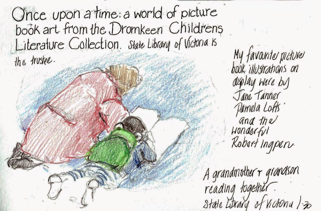
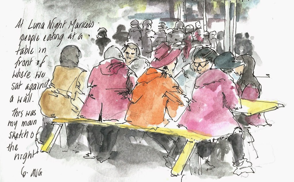
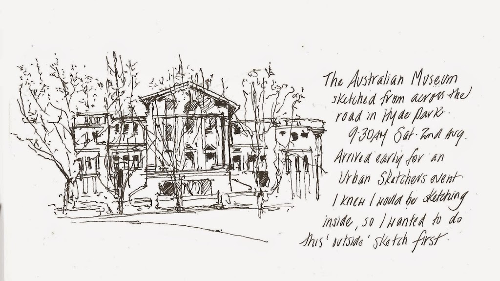
      I draw daily using watercolour pencils in a Moleskine watercolour (13 x 19 cm) sketchbook, which I love and will continue to use.
      But sometimes I want to do a more “finished” drawing  on a single A4 or A3 sheet.  I have been trying to find the equivalent of my Moleskine textured paper in this format, as Moleskine do not make their own paper and cannot be bought in sheets.
      Recently I have been also using a pad of Arches Smooth 300gsm , was getting increasingly frustrated with the interaction of my watercolour pencil, water and the paper . I was finding that the pencil pigment on the  Arches gets “furry” or “fuzzy” as I pull the colour across the paper with water. This is the only way I can describe it.
      In reality the difference is so subtle it is probably something that no one else would notice. So this is a very subjective review, as I am looking for something that suits me. But I thought I would share my experience.
      I asked advice on Facebook groups and also looked online.  I received a number of number of suggestions which I took to my local art shop Parkers in Sydney .  After half an hour with a very patient assistant, I walked away with six sheets of paper (they did not have some of suggested brands : Aquabee, Holbein  Rhodia & Levenger) . Even when I was in the shop I could see and feel the difference between the papers, although after a while they all started to look the same and I was a little overwhelmed, so I made my purchases and went home.
      Of course when I got home I sketched my newly purchased papers
      there are subtle differences in the colour of the papers

      UPDATE 2015 – I found the perfect paper – .It is called University paper. I believe it is produced by St Cuthberts Mill in the UK . Available at Deans Art in Melbourne ! In sheets.  210 gsm

      I have never tested papers before, so it was all experimental.   I cut the paper into 13 x 19 cm rectangles (size of the Moleskine) .  I had only recently discovered that papers have a front and back side to them, so I have one for each.
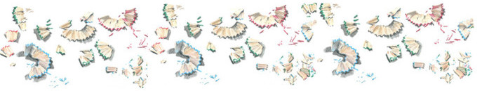
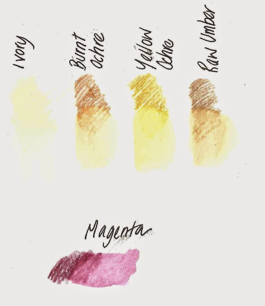
      I decided to test the colours and shapes that I have been drawing recently . Ivory Black – a colour I use in feathers and Magenta for macarons. I did a scribble of colour and then spread it out with a paintbrush. I wrote my thoughts down immediately on the paper before moving onto the next one.  Some were quite similar, but there was a difference.
      Unfortunately the scans of the completed tests shows no difference between them. It looks like the same test fourteen times. so I won’t put them up online, but I will describe my immediate reactions and thoughts.

      I have listed them from the best match to the least

      The winner  is ….

               Lana 300 gsm Hot Press
      FRONT – has more texture than back
      BACK  – smoother than front. Not furry at all spreads well
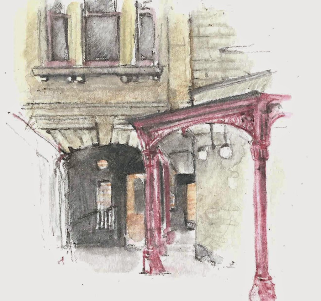
      I then drew a whole egg, feather and macaron, just to double check. It feels good!
                         Here are the other papers I tested and my thoughts.


      Fabriano Soft Press 300 gsm

      BACK not furry & spreads well, but settles furry. Paper has a bit of texture , not good for fine lines of pencil only
      FRONT Paper fells thick not furry

      Canson Montval 300 gsm

      FRONT Textured paper
      BACK not furry at all. Too much texture on paper

      Arches Smooth 300 gsm

      BACK furry
      FRONT  furry

      Bristol Board
      Whoosh – glides off the page too smooth. Can’t get really dark lines
      Fabriano Hot Press 300 gsm
      FRONT Pigment does not spread well , stops and starts shows edges. A little more furry
      BACK a little furry pigment does not spread well. stops and starts shows edges spread across spreads too much pigment
      Saunders Waterford 300 gsm HotPress
      FRONT furry . takes pencil well on its own. Not so good with dark colours. Front more furry than Back
      BACK a little furry

      if anyone has any other thoughts or suggestions please let me know. I now just have to learn how to cut sheets into even papers….

      My different styles of sketching

      Today, Saturday, I did four drawings, each in a different style. I thought that this would be an opportunity to write about it.

      I draw with watercolour pencil and also use a Lamy Safari Joy ink pen. Depending on the day, how I feel, I use them in  different ways. Sometimes in combination and sometimes on their own. Some are quick sketches in minutes capturing a moment, others are completed over a few nights, as a study. 


      A quick unplanned sketch of some  buskers Winterbourne in the Pitt Street Mall. I found a place out of the crowd, leaning up against a wall, and decided what to include. I started with the main guitarist, then the second one really got into it and so I quickly sketched him.  I then added the onlookers.


      Lunch –  sushi at David Jones . Sushi is such a sketchable subject, so I chose my lunch subjects for their aesthetic value. And sushi doesn’t get cold as you sketch , and you can have multiple plates to choose from . This was drawn and coloured on the page in watercolour pencil and then I used waterbrush to spread the colour, then added some more pencil lines. I ate the avocado sushi and then drew the second  sushi and then ate it !


      The next sketch was when I arrived very early for my hairdressers appointment. I found a place in the sun, leant up against a wall and spend about half an hour on this.  I drew in the lines of the buildings, either in their colour (such as Burnt Yellow Ochre for the cliff) , or Paynes grey . I then took colour off the tip of the pencil with the waterbrush and adding it to the page. Then I added the final lines of street lights and poles.


      and finally a more studied drawing of some watercolour paper that I bought . I spent half an hour with the helpful (and patient) staff at Parkers Art Supplies in Sydney looking at a number of papers. I bought five.  I am going to use them to test as I am looking for a comparative paper block or sheets of my wonderful Moleskine watercolour sketchbook. I am still going to continue using my journals but am drawing some more “finished” subjects on loose sheets. I will be writing a separate blog post on this.

      Sydney city people and places

      Sydney city, like all others, is made up of both people and places. I have been out sketching both this week, with my watercolour pencils
       
      Martin Place is a pedestrian area that extends over several blocks. There are large areas for the public, including a stage and steps. There is also space where skateboarders congregate. It is school holidays, so there was a younger crowd there this week. The are so quick and hard to draw. I needed to watch them do the same trick over and over again before I could get it on paper. If I watched them often enough I would have a better understanding of where all the limbs go !

       
      The Big Issue seller in Martin Place. The Big Issue magazine is a fortnightly, independent magazine that is sold on the streets by homeless, marginalised and disadvantaged people

      a coffee shop in Hunter Connection, Wynard . I went there because someone recommended the coffee and because of the coffee cups. I did the sketch in Payne Grey watercolour pencil while I waited for my coffee. There was a bit of a queue , but they were quick, so I did not get very long to sketch. Coffee cup sketched later .

      Sydney sketches today

      Sydney is enjoying the warmest winter in years. The day time temperature has not dropped below 20 degrees and this week there have been blue skies and sunshine everyday. I made the most of this opportunity and sketched . Today I was inspired (and had the time) to do two sketches, one before work and one at lunch. These are both sketched in Martin Place at the GPO end near the Westin.

      As it was such lovely weather, lots of other people were out and about in their lunch hours too. That is why it is nice to come into work early and sketch at 8am.  I can sit in doorways of stores that are usually open through the daytime.


      I am very pleased with what I can capture on a page in around 30 minutes. I like the vignette style and the little scene. I think that this style has only come to me recently. It is one of the styles that I would like to use when travelling. I also like to use pen and ink as well to do this style of sketch. I also like to do a very quick sketch of people and crowds. I have a variety of styles and it depends on the scenes (or most usually) what I feel like on the day to which one I use.


      I start with a very few lines in pencil. Just some basic horizontal and vertical lines and for these, the arches, just so that I don’t miss out on a level of the building. Then my lovely watercolour pencils come out. I draw in the lines and areas in their colour, Then I apply the waterbrush, then more watercolour pencil and so on until it is time to go !