Christmas is coming. The countdown is on. I have four Christmas cards for sale in my Etsy online shop!

This card is not Christmas specific and could be given at any time of the year

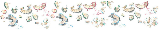
I chose four watercolour pencil drawings which I drew over the past few years. In the past I have photocopied and printed these drawings and given these to friends and family. This year I decided to have them professionally printed by my Melbourne printer and add them to my growing range of cards.

This card is not Christmas specific and could be given at any time of the year

Of course you could give the gift of cards and purchase a selection of my other cards of feathers ,nests, books and library shelves !
All of my Greeting cards are printed on 300 gsm Cream card
Size 130mm x 180mm (5 1/4 x 7 1/4 inch)
and come with an envelope in a sealed clear cellophane bag.
The card is blank inside, so you can write a long, inspired message or a simple, short note.


![IMG_0017[1]](https://i0.wp.com/www.alissaduke.com/wp-content/uploads/2015/10/IMG_00171.jpg)
![IMG_0001[1]](https://i0.wp.com/www.alissaduke.com/wp-content/uploads/2015/10/IMG_00011.jpg)
![IMG_0018[1]](https://i0.wp.com/www.alissaduke.com/wp-content/uploads/2015/10/IMG_00181.jpg)


![IMG_0945[1]](https://i0.wp.com/www.alissaduke.com/wp-content/uploads/2015/09/IMG_09451.jpg)


